
 Credits
gabrielle
marquez
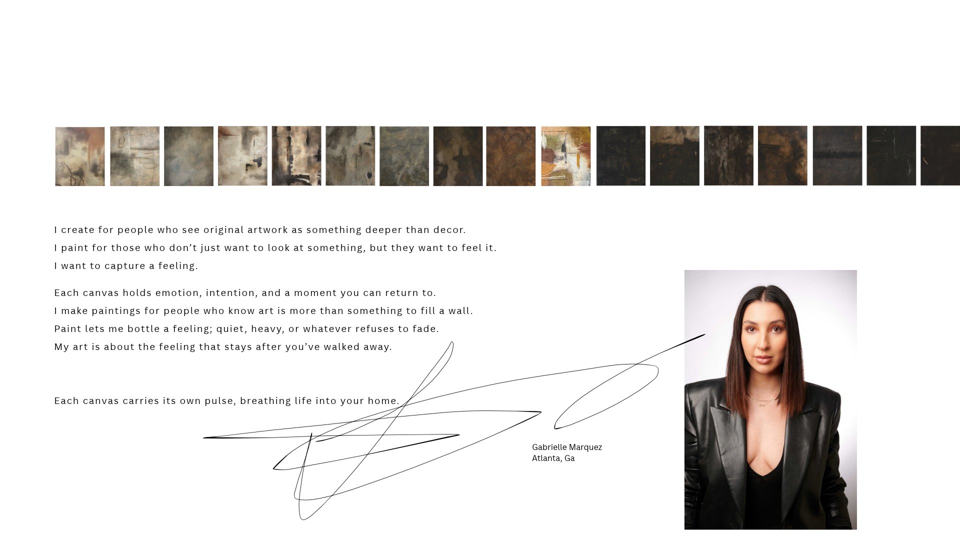
Paintings for people who want to feel something, not just fill a wall.

 [the feeling]
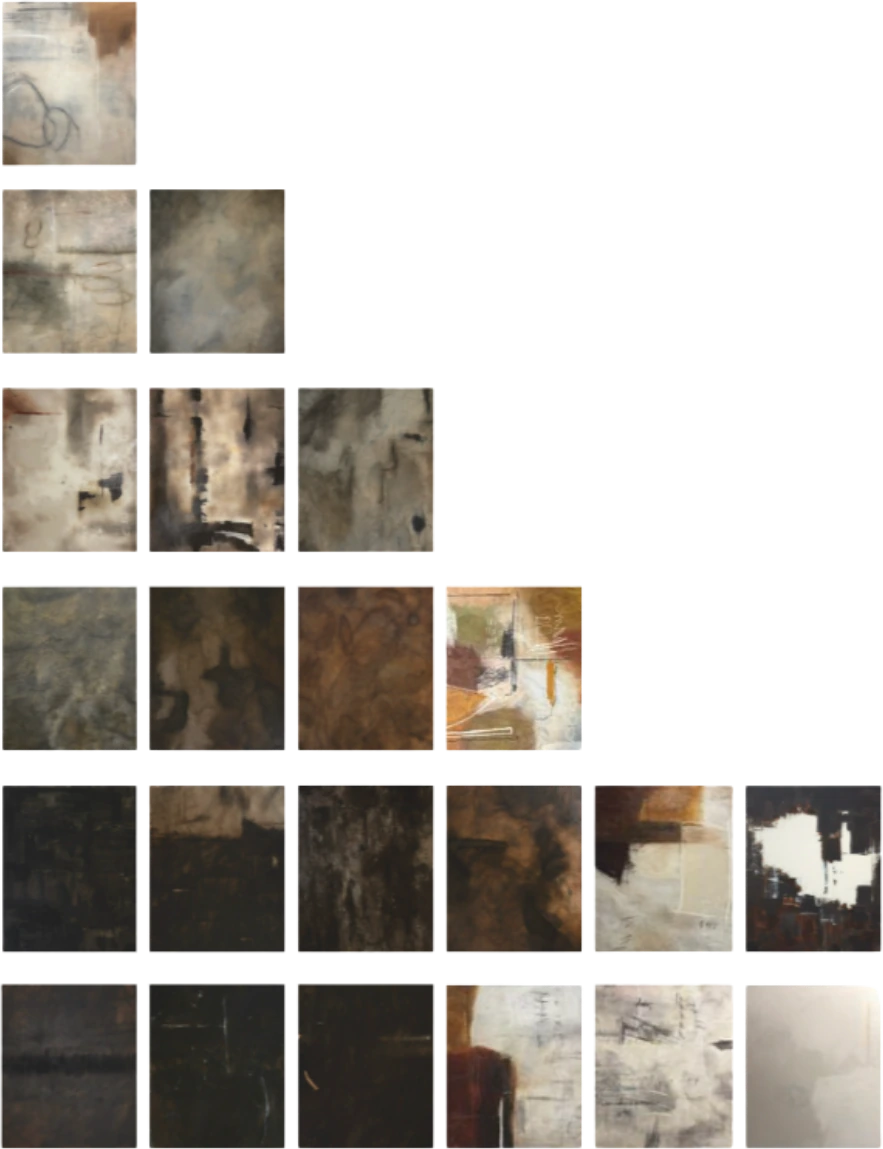
cold.dark.heavy.textured.layered.sensual.blood play.hidden meaning.uncomfortable memories.
We built the identity from the way the work feels, not from a logo. Nine words, set quiet and low, so the paintings carry the weight.
Small bracketed labels, a warm stone palette pulled from the canvases, and room to breathe. The same system runs through the catalogue, the graphics and the site.
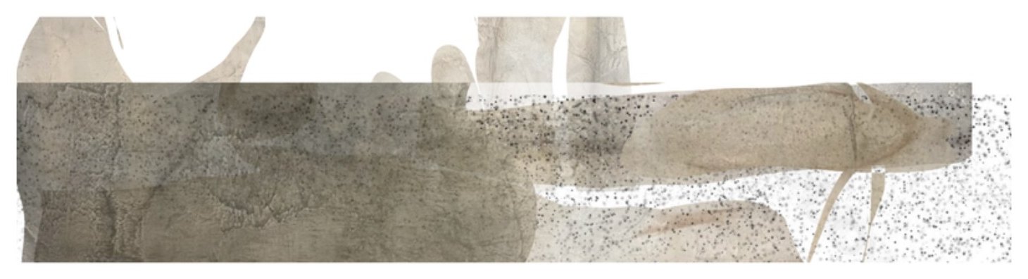
[the identity]Graphics that feel like they were pulled off the canvas.
Torn forms, raw texture and the [unveiled] mark. Built for social, print and her own announcements, so everything she posts looks like it came from the same studio wall.

 [the catalogue]
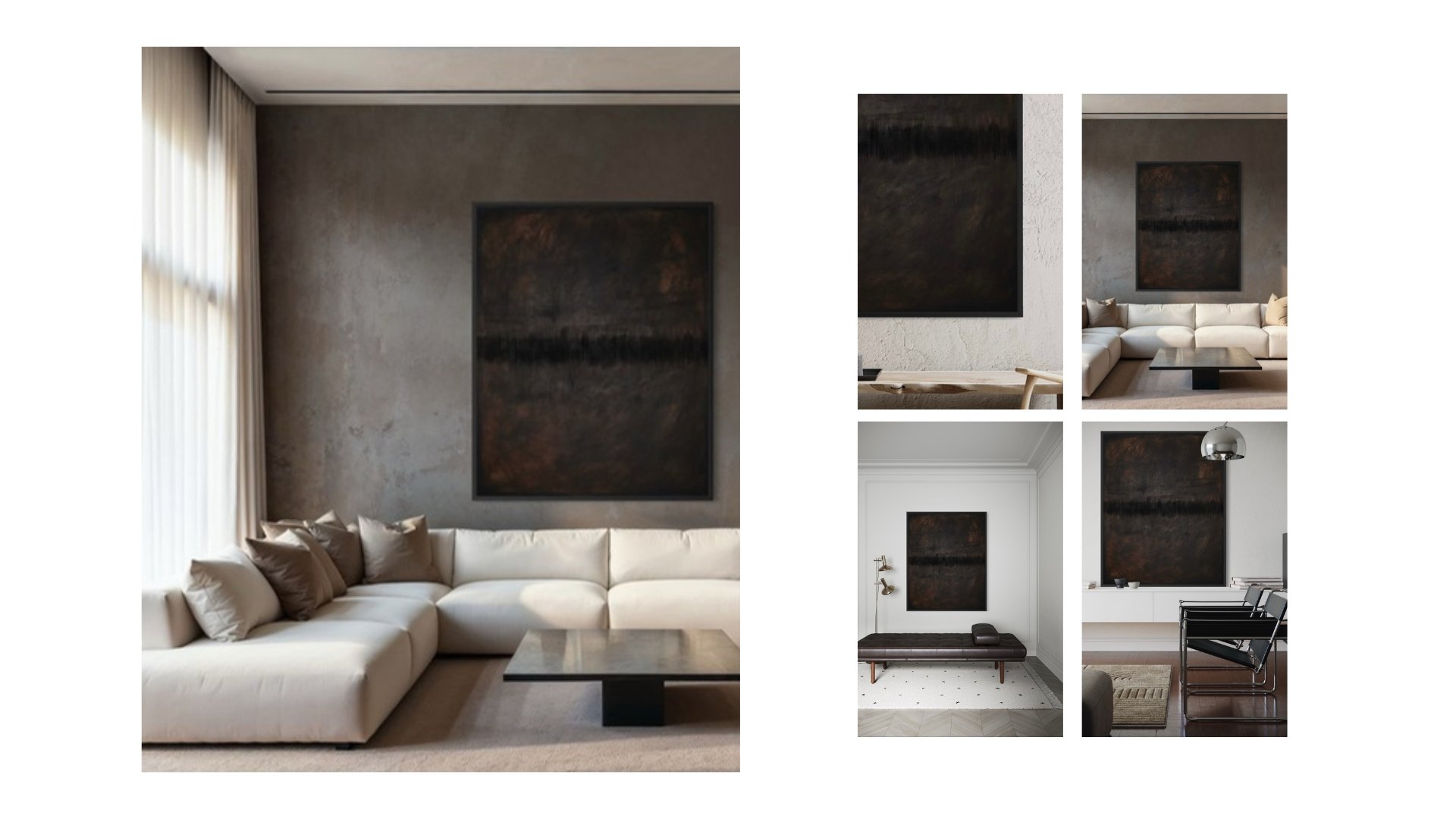
Fifty pages that sell the room, not just the canvas.
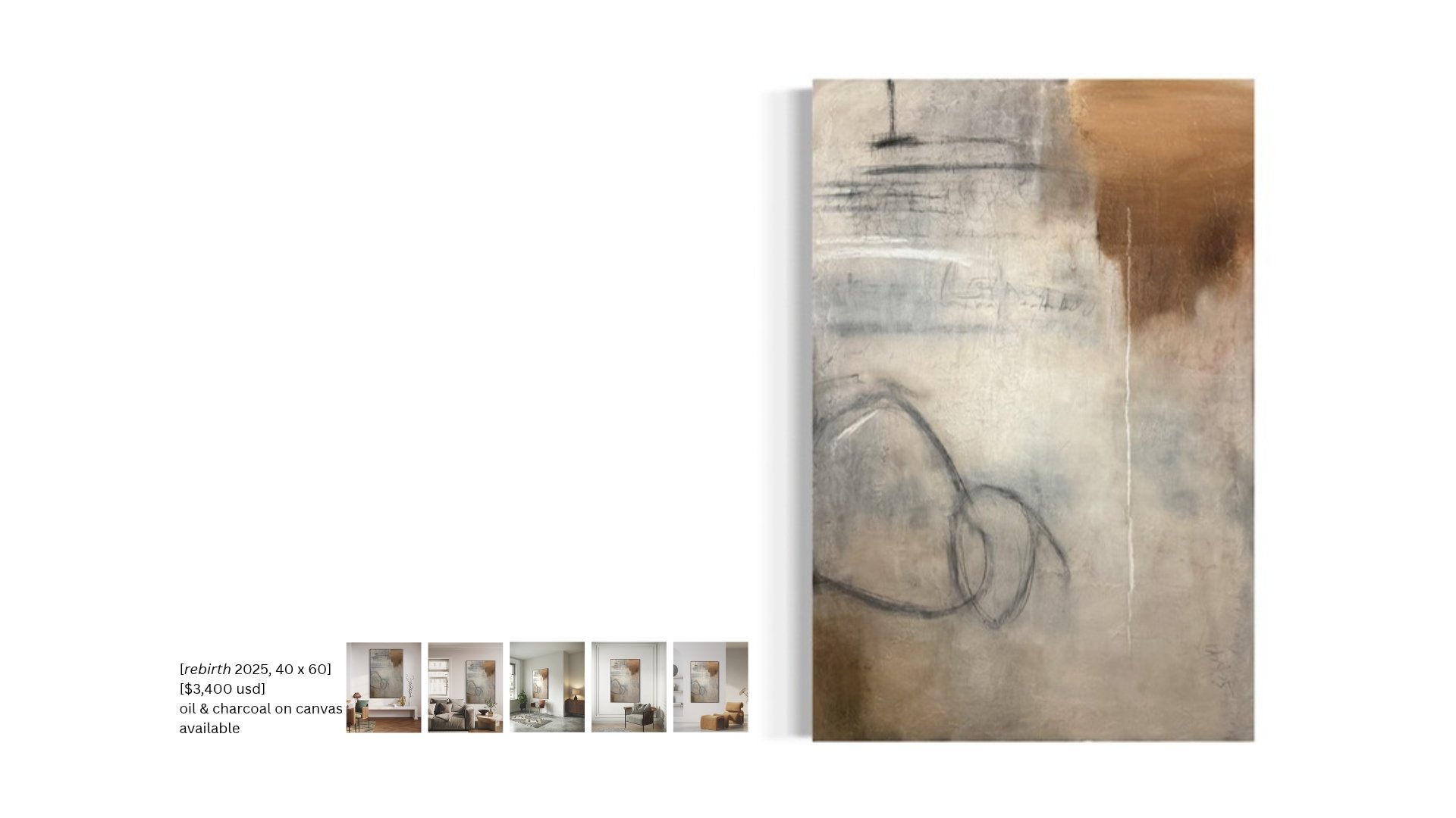
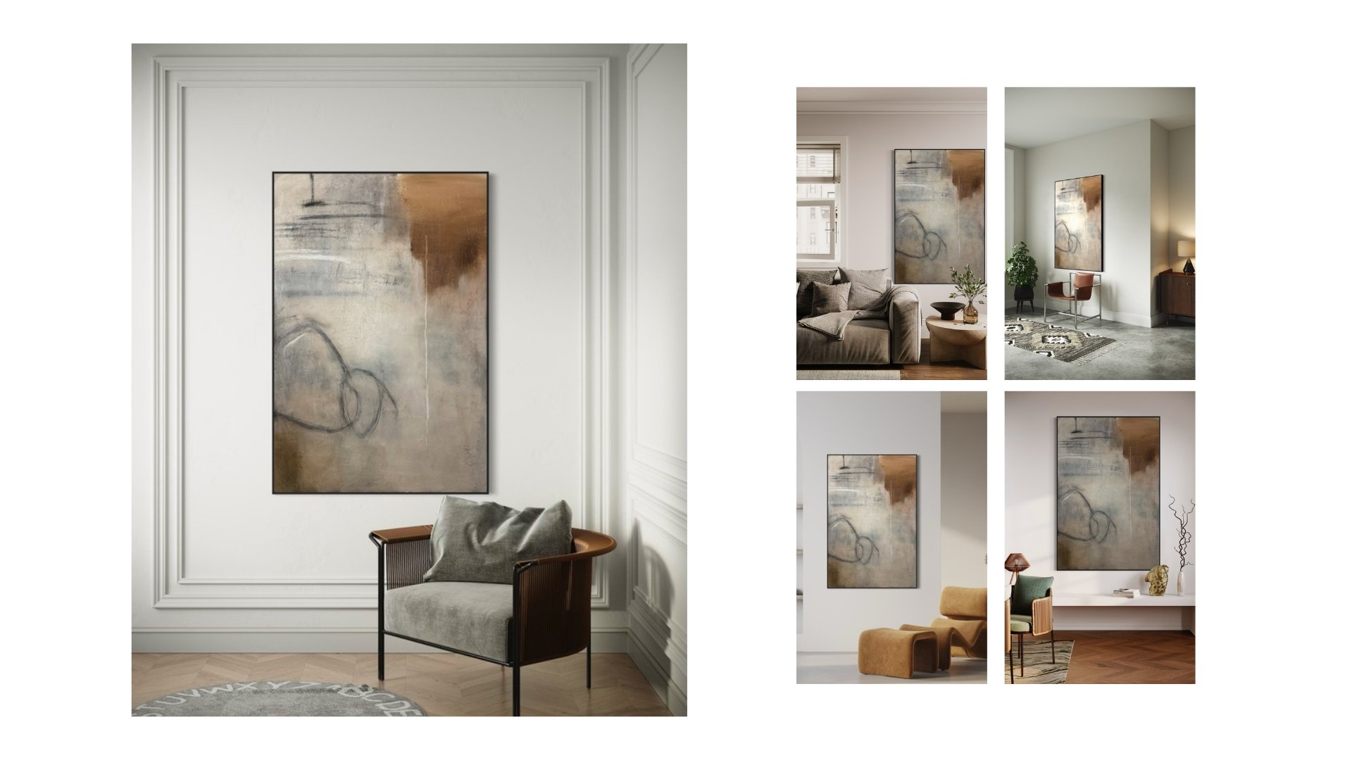
Every painting gets two spreads: the work with its size, medium and status, then the work living on a wall. A designer can flip through and picture it in a client’s home before they ever ask a price. We keep it current as pieces sell.
 [the work]
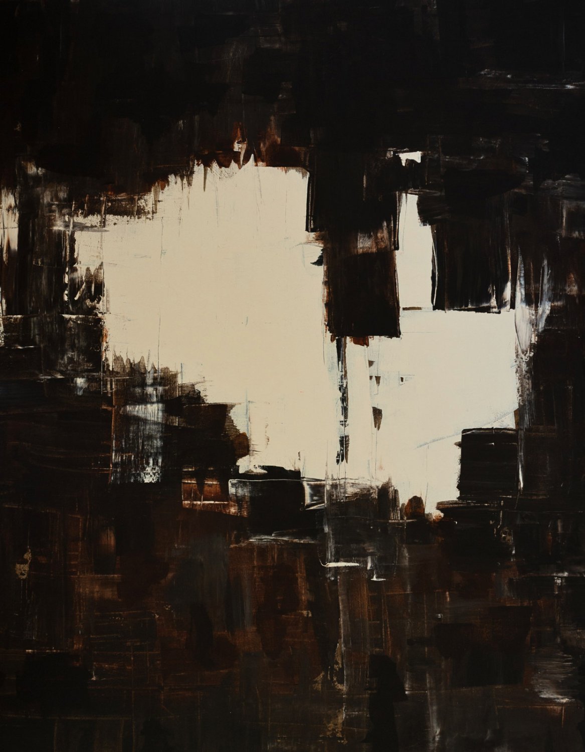
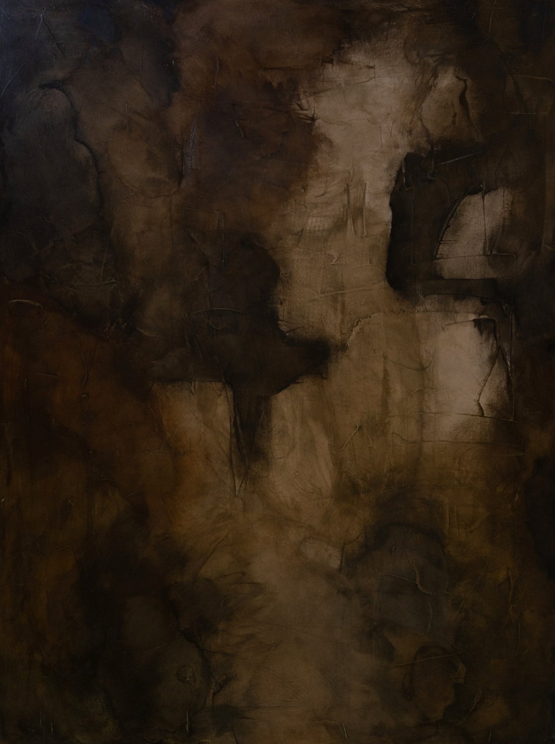
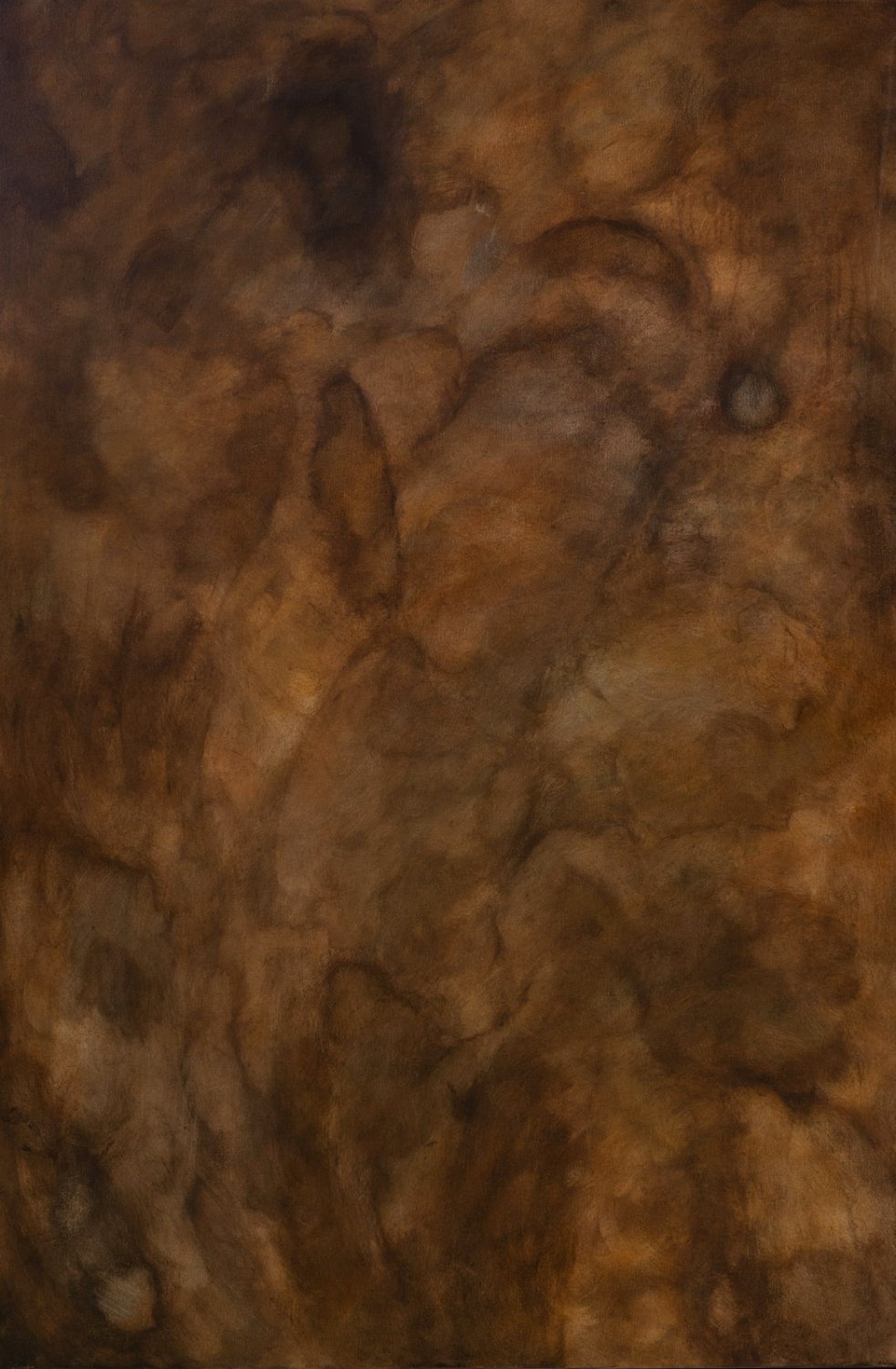
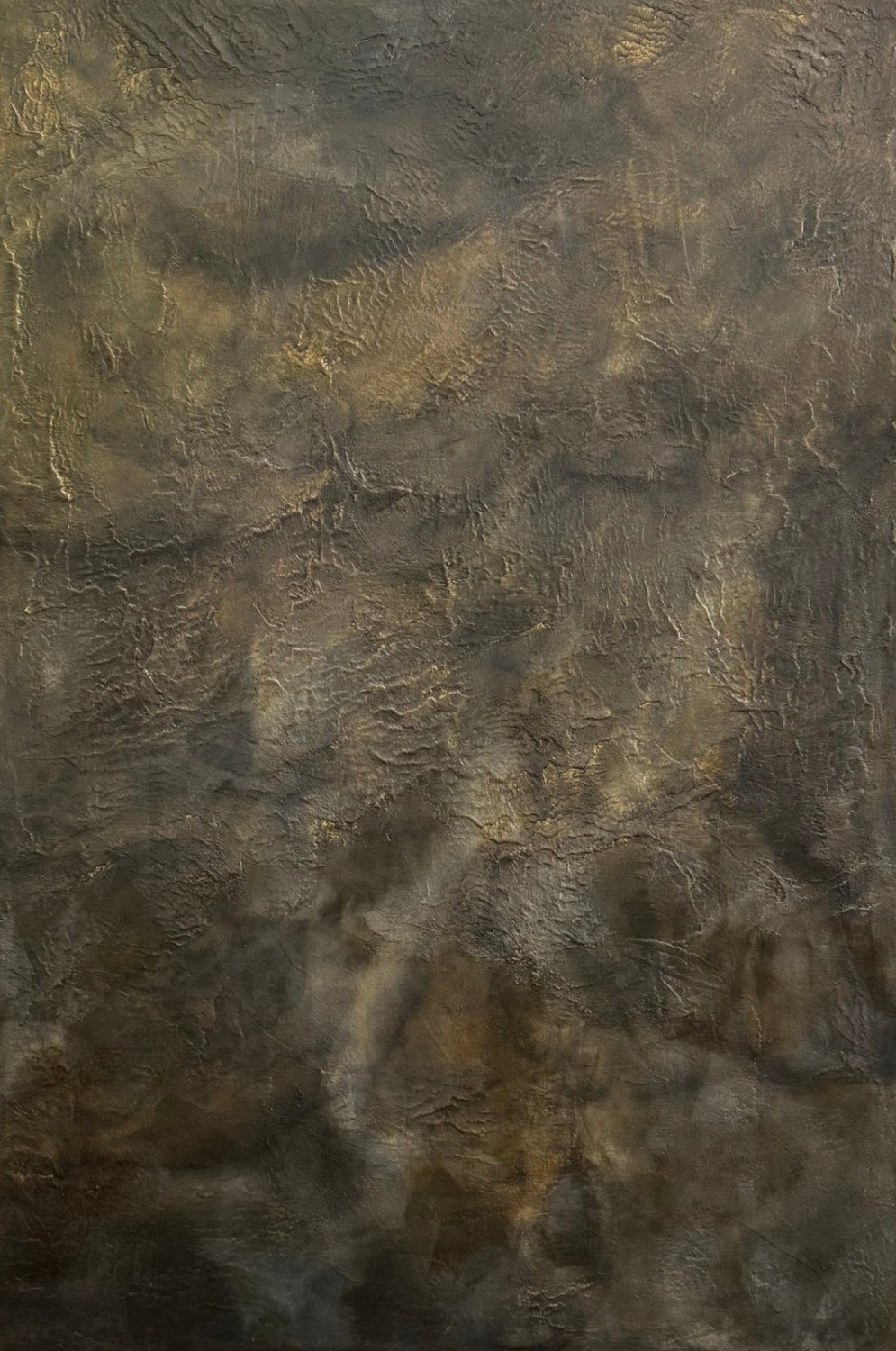
The paintings lead. Everything else gets out of the way.
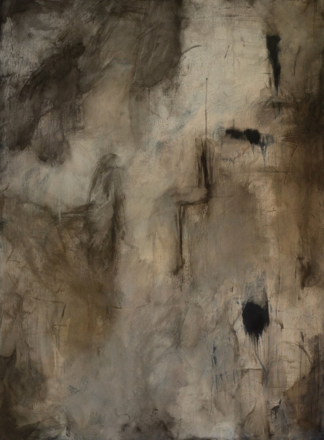
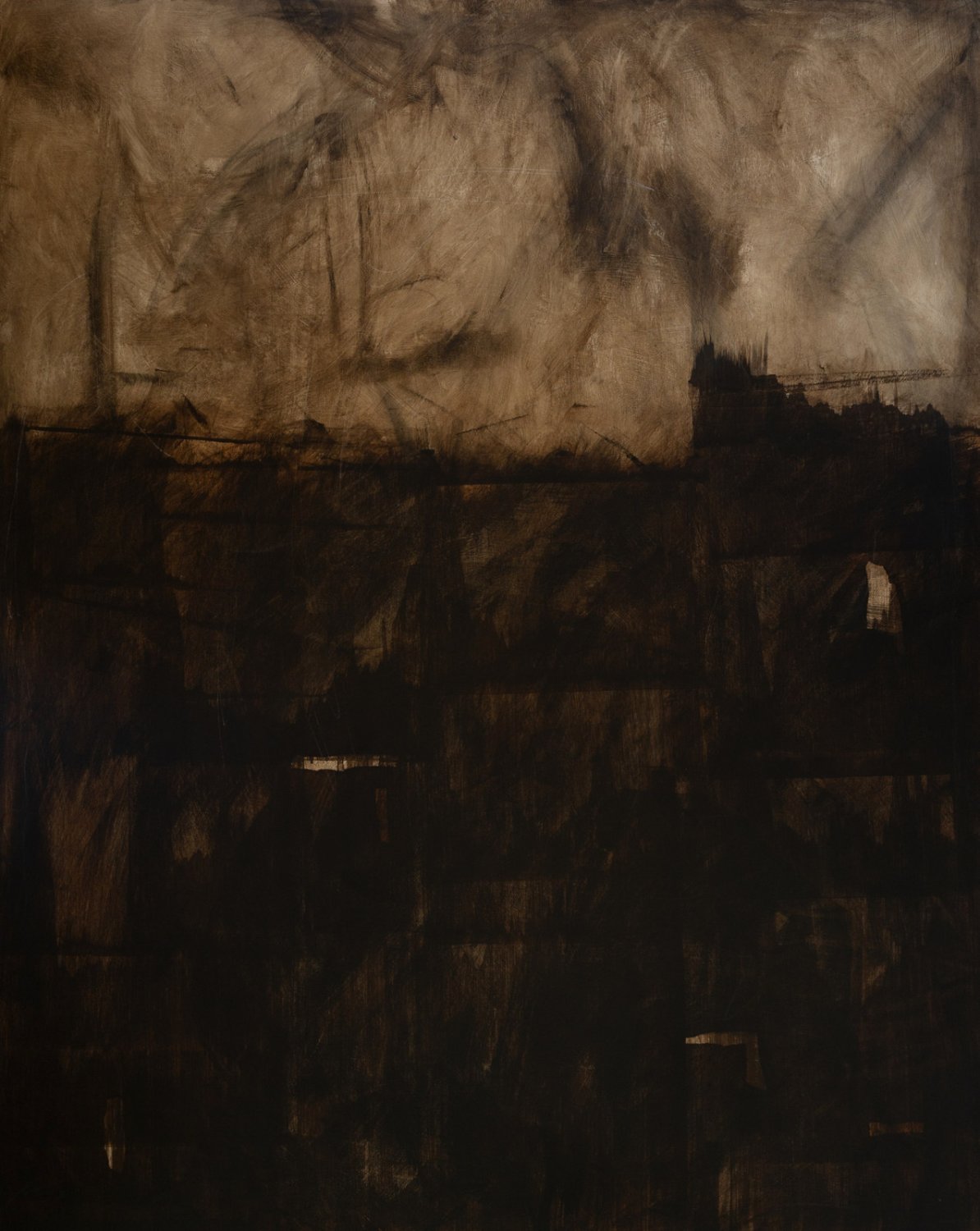
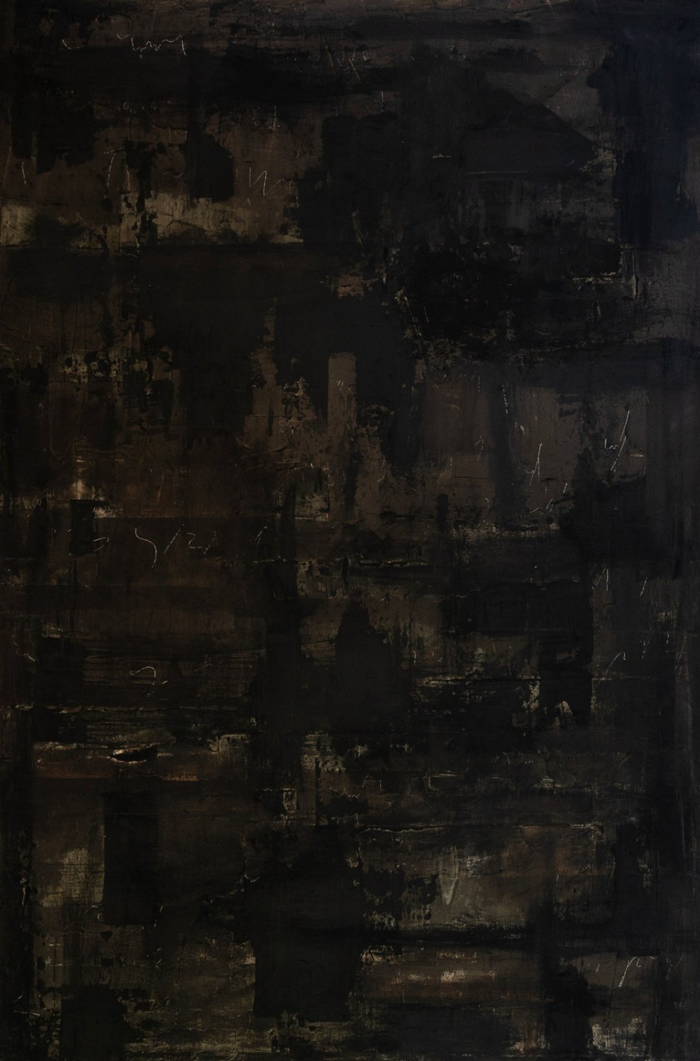
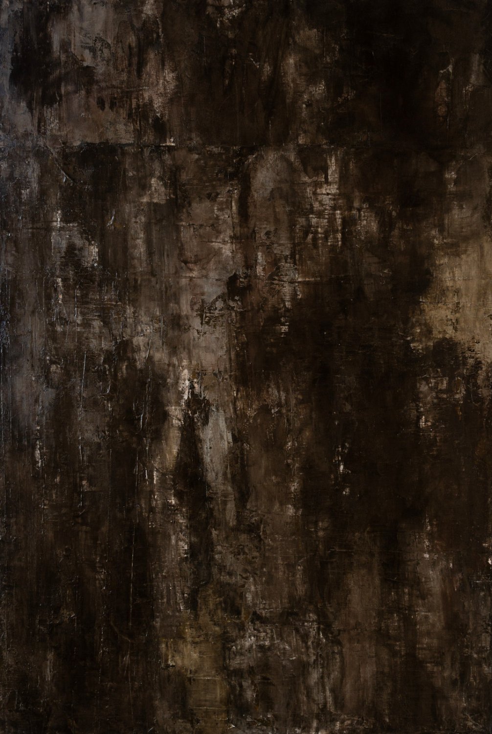
 [collected]
works sold to private collectors, a design firm and interior designers.
works now hanging at Gallery Anderson Smith.
[next]A new home, in Webflow.
We built her first site to sell by enquiry, leading with paintings in real rooms. Now we’re rebuilding it in Webflow so the work loads fast, reads beautifully on a phone and gets found in search.
gabriellemarquez.com ↗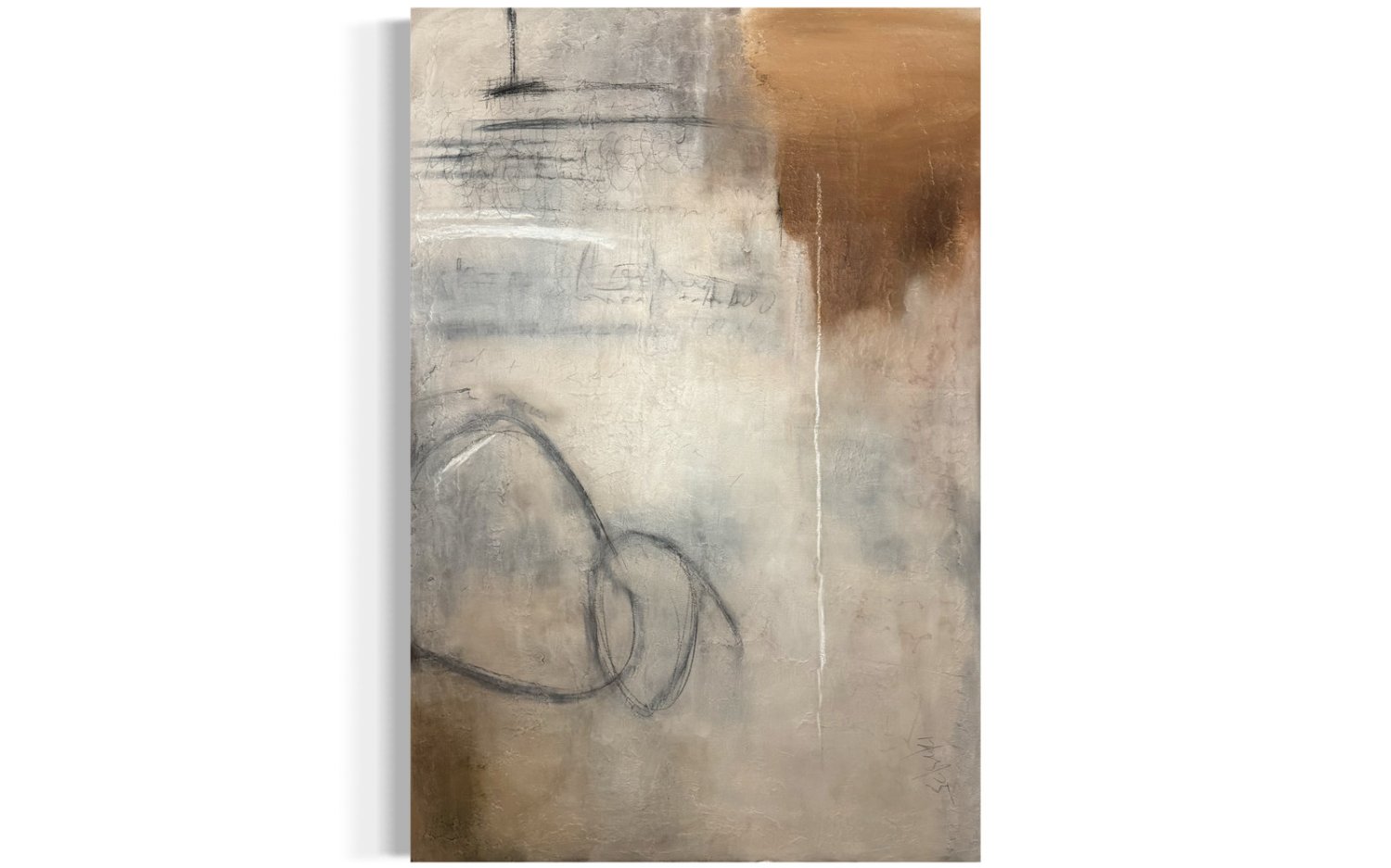

 Back to Five Eight OneNext world